About the Project
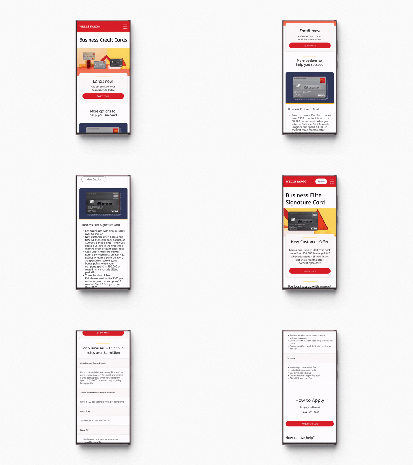
Wells Fargo is the third largest financial institution in America and serves over 70 million customers nationwide with over 140 legacy consumer facing web pages
Challenge
Responsive Redesign of Small Business and Merchant Services Consumer Facing Pages
My Role
-Product Strategy
-Stakeholder management
-User research + analysis
-Persona creation
-Content Strategy collaboration
-Wireframes
-UI Design & Prototyping
-Negotiating timelines with Engineers in the CMS team
-Project Planning into Design Sprints
-Figma component library creation
-Usability Testing
Market Research
Key Findings:
#1 Responsive
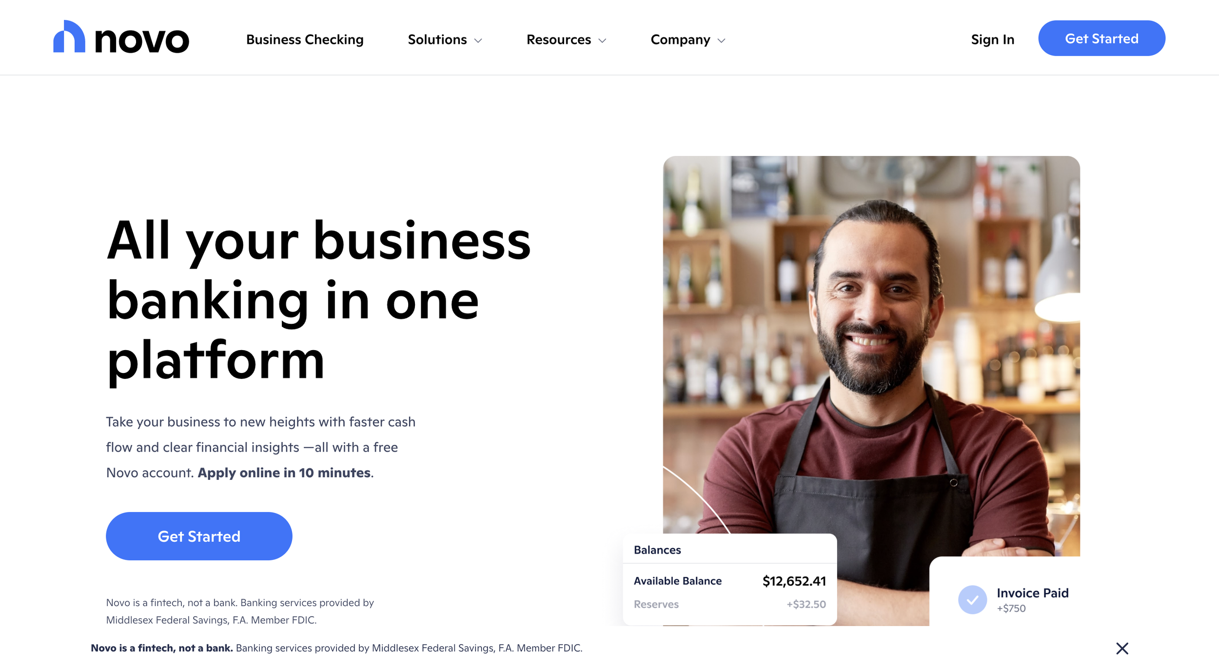
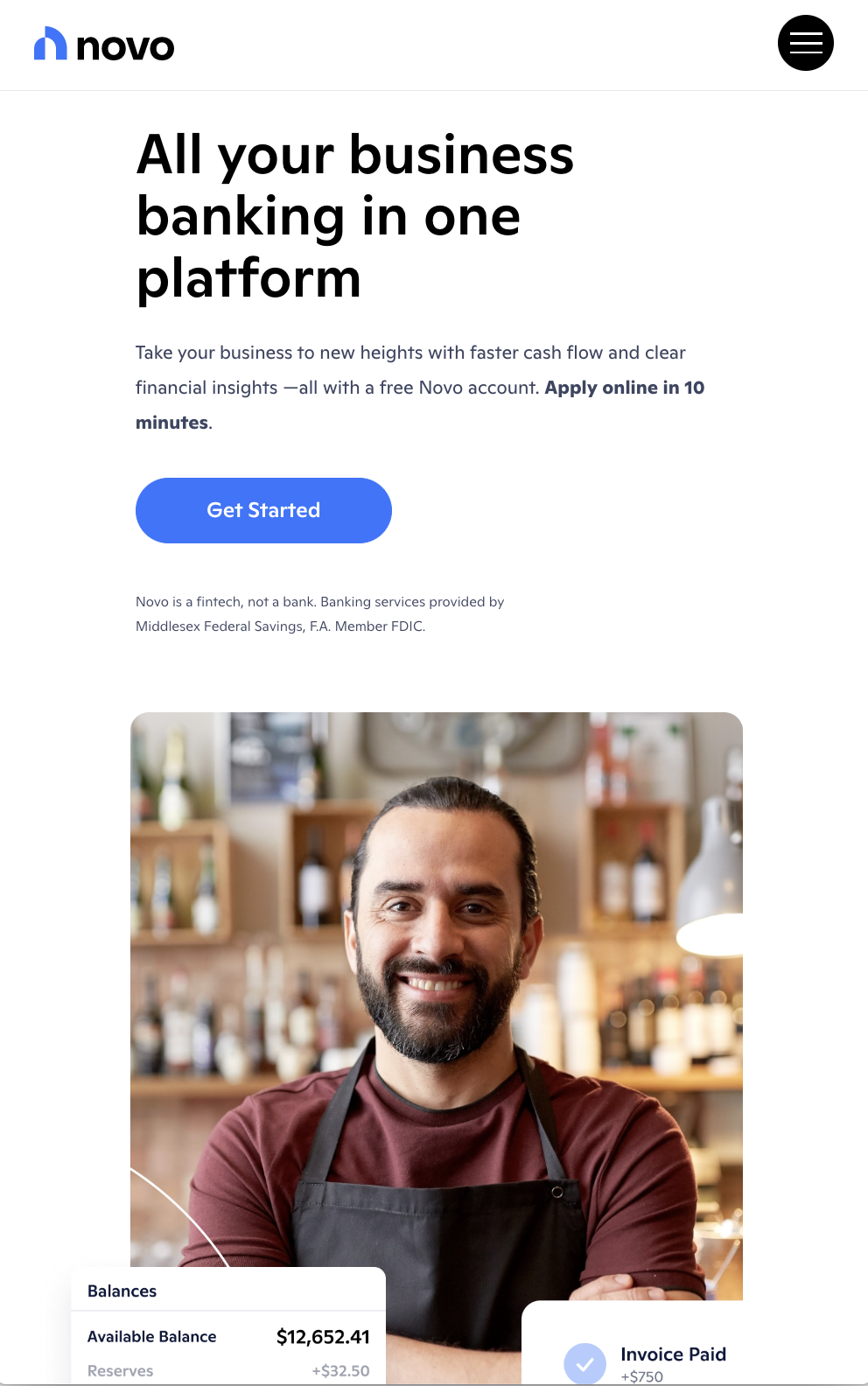
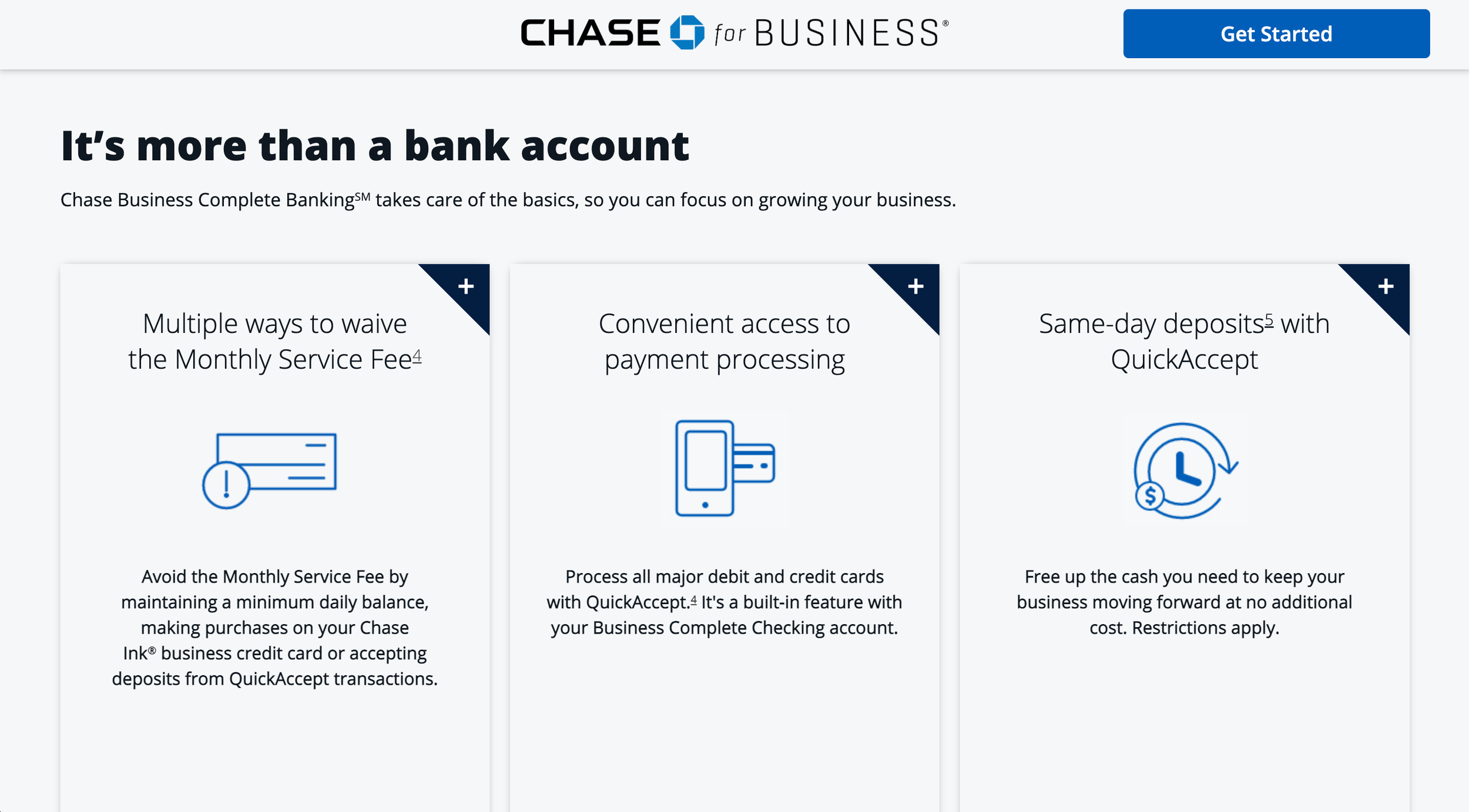
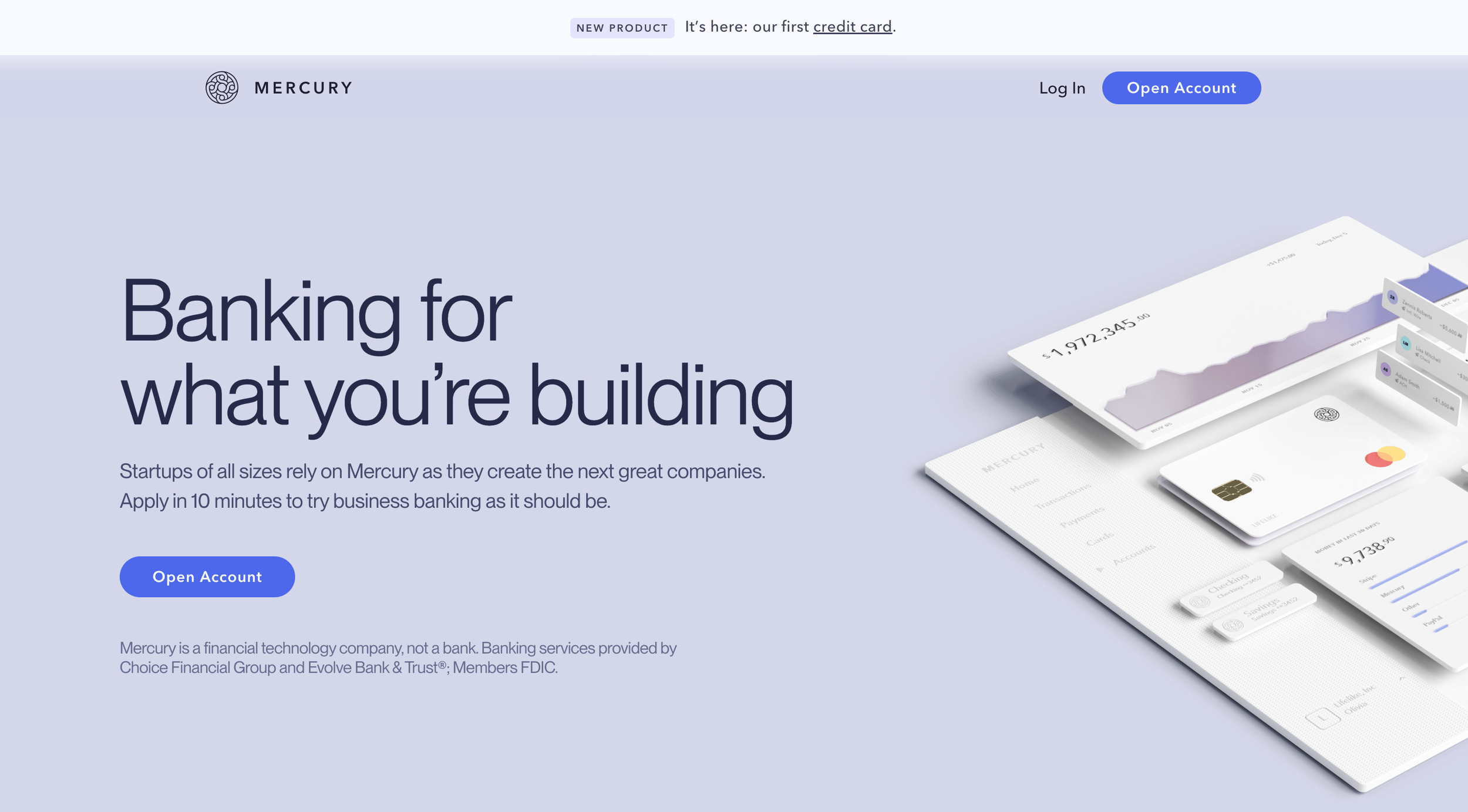
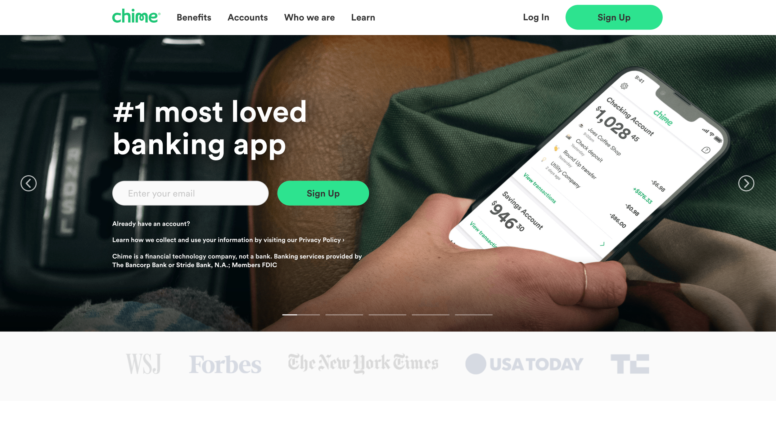
Successful competition had already made the switch to responsive from adaptive.
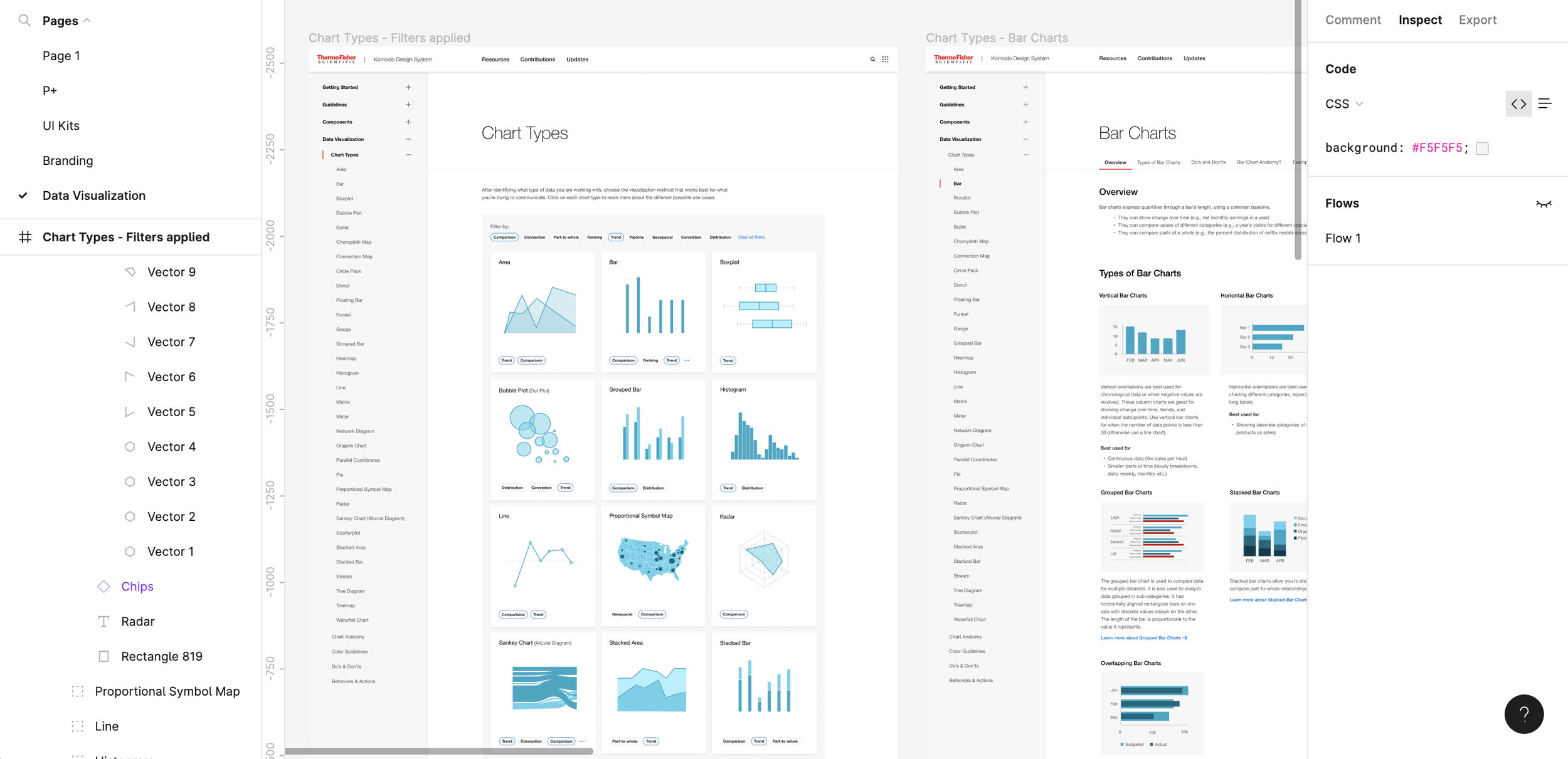
#2 Figma Design Library
Utilizing Responsive Components that adjust according to screen size automatically and features like Autolayout is essential to maintain consistency across all consumer facing pages.
#3 Less is More
Successful competition has understood that consumers prefer less copy and more visuals to communicate the same message and they've applied this direction into their content strategy.
User Research
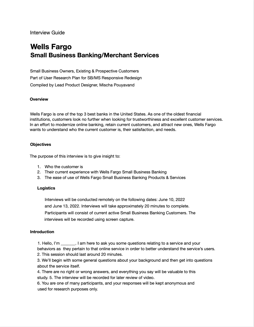
Digging into the user research that had been conducted over the last few years, I started to get a better idea for who our consumers of small business banking were, what their needs were, and ultimately how to better serve them.
-Created user research objectives
-Created an interview guide (left)
-Conducted 42 user interviews of current and prospective customers
-Compiled the following User Personas [below]
User Personas
Who is the Small Business Owner?
Who is the Small Business Owner?
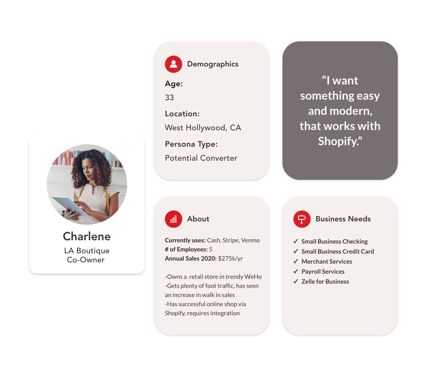
Established Business Owner
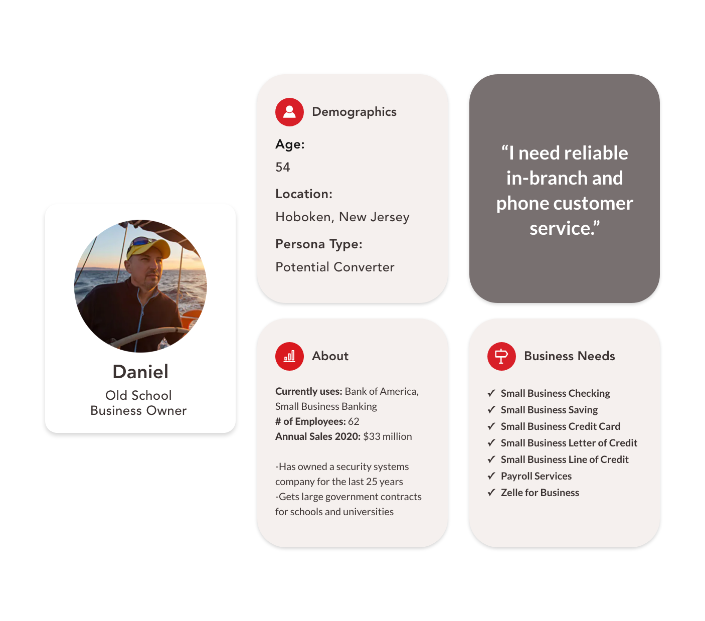
Old School Business Owner
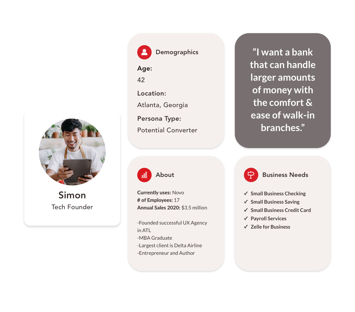
Tech Founder
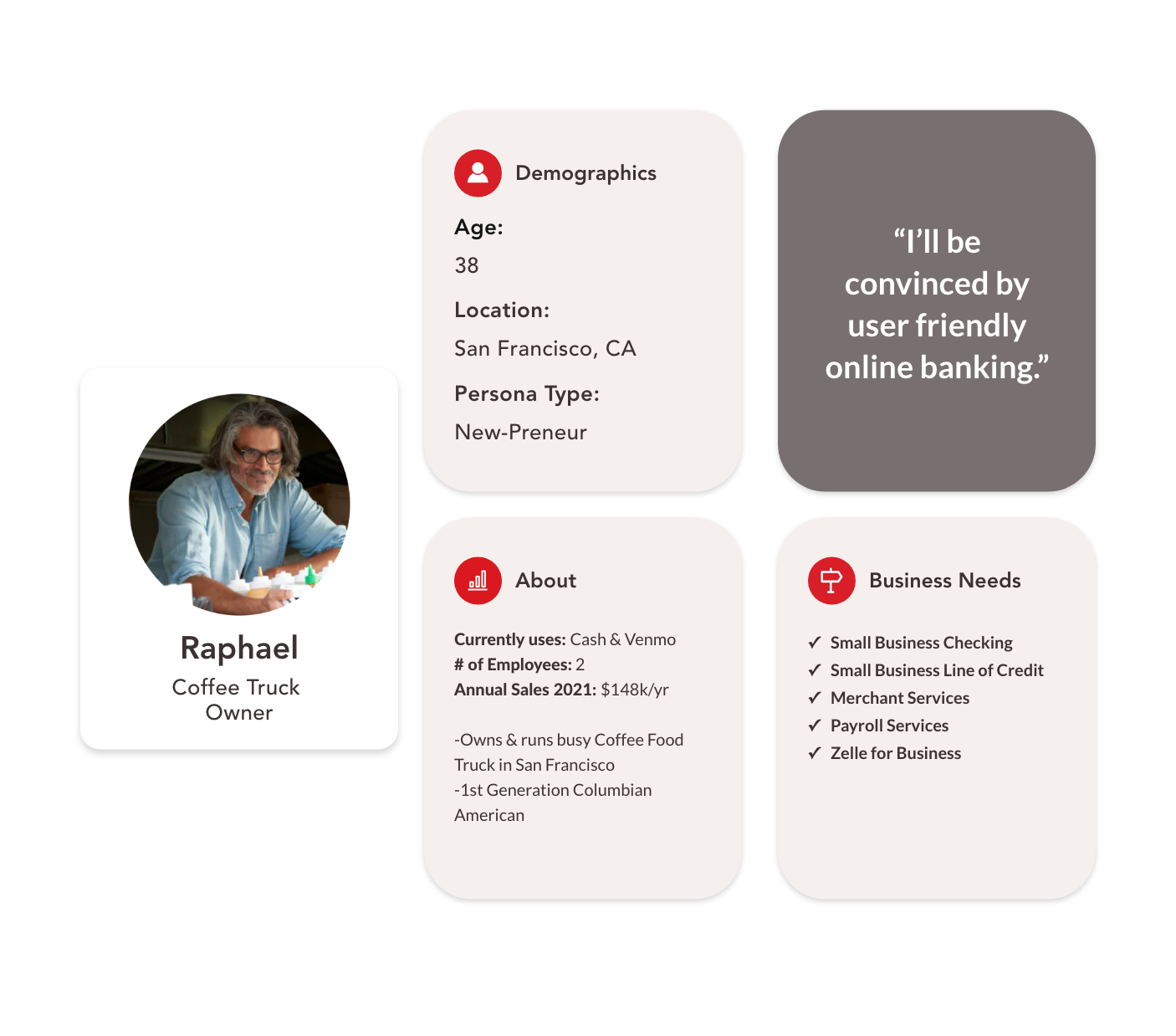
Brick n Mortor Small Biz Owner
Information Architecture
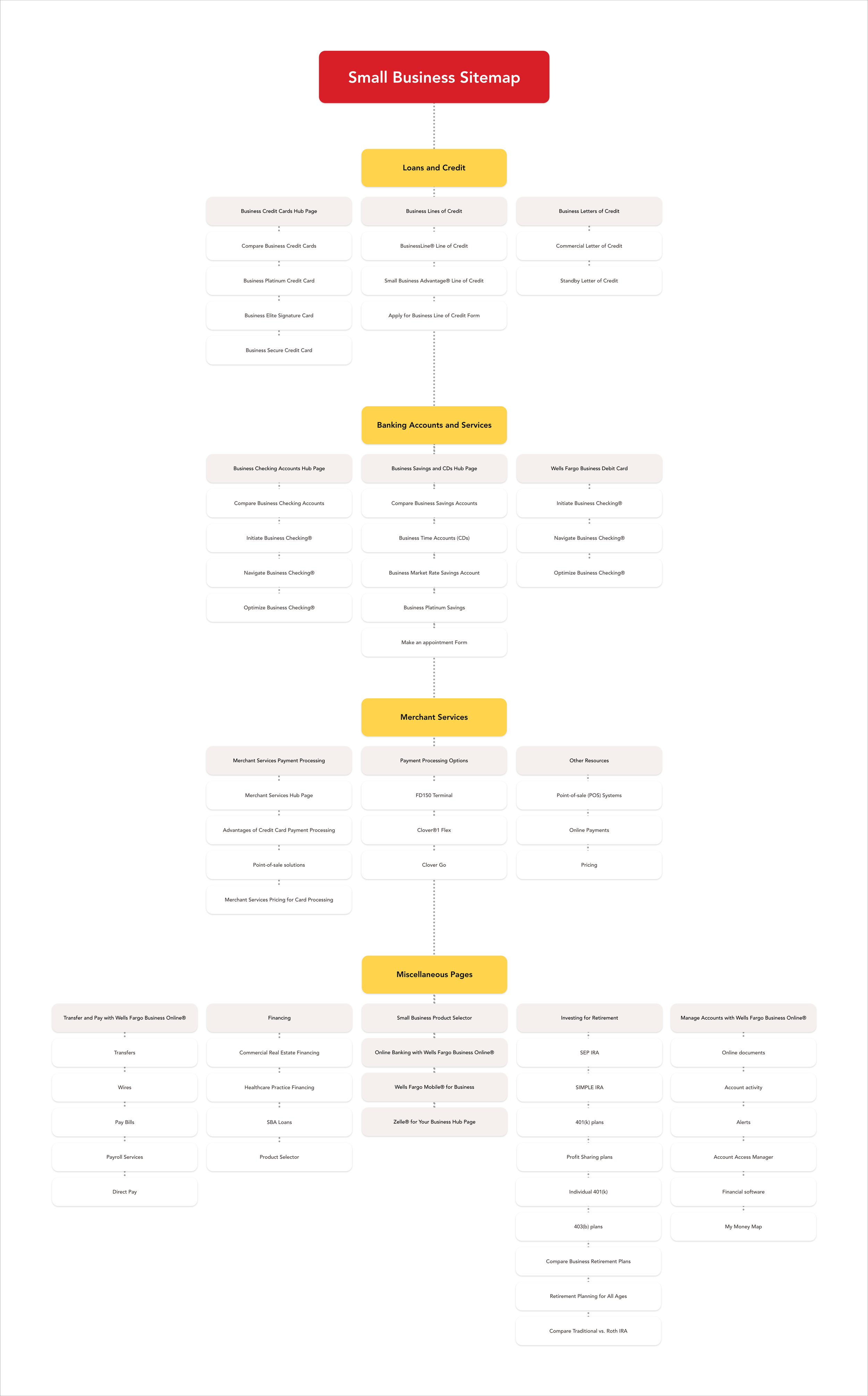
As all the legacy pages on Wells Fargo's website were slowly getting converted to responsive redesign, my team and I were tasked on taking inventory of all of these pages and planning design sprints to break out the process of recreating each and everyone of them.
Meeting regularly with our business stakeholders to plan priority of the pages to be redesigned gave us insight to the company's business needs and objectives while taking into account development constraints.

Problem Statement
The current website is:
Not mobile responsive
Difficult to navigate
Has low conversion rates
Ideating Solutions
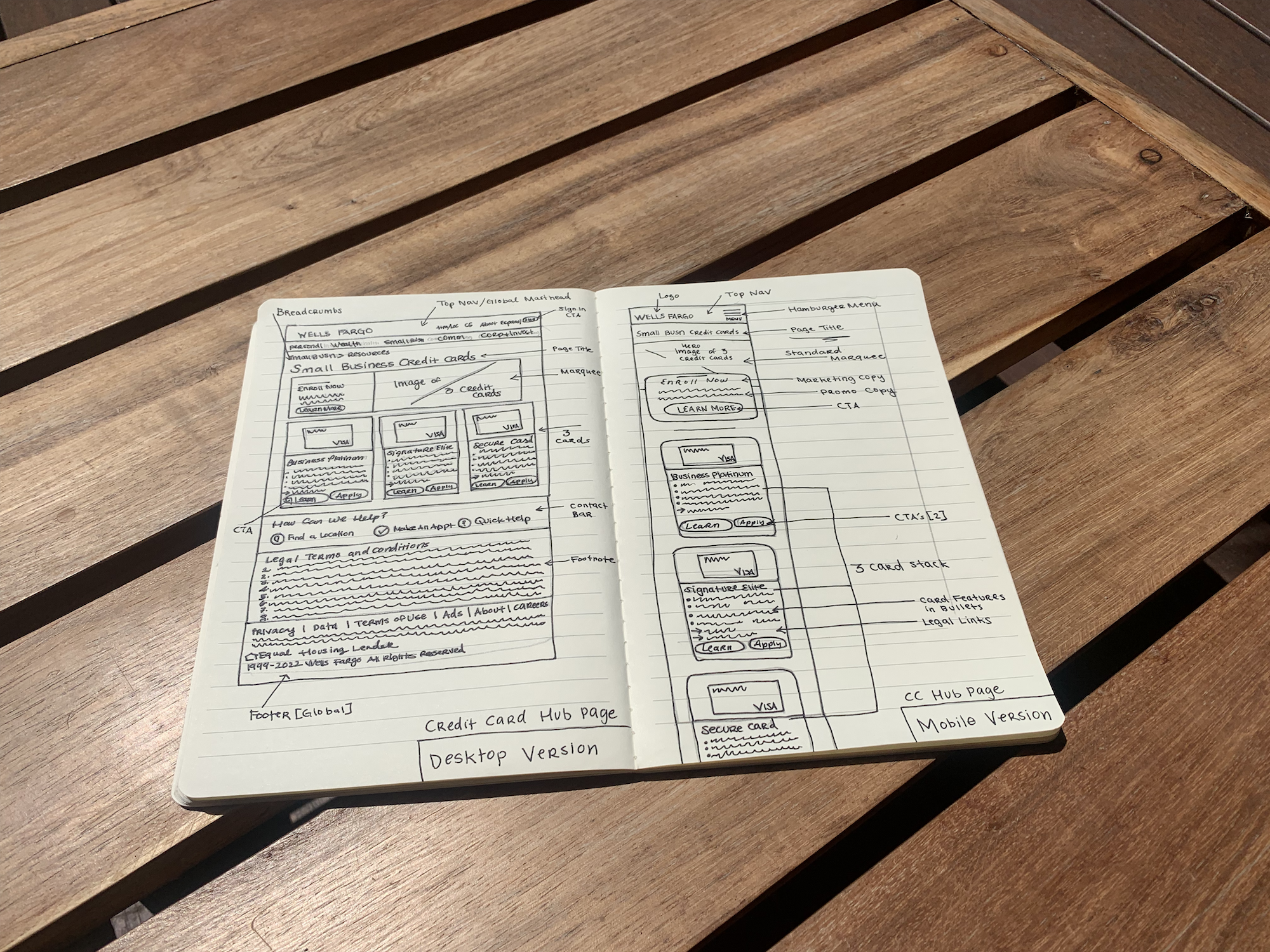
Creating low fidelity wireframes for Wells Fargo's consumer-facing Small Business pages involved sketching simplified layouts and structures to plan the user experience and interface design. These wireframes serve as a blueprint for the final design, focusing on content placement and overall structure without delving into finer details or aesthetics. The process involves outlining the basic layout, defining key components, planning user flow, and iterating through collaboration. Once feedback is incorporated, the wireframes can be used to create high fidelity mockups and prototypes for a more accurate representation of the final design.
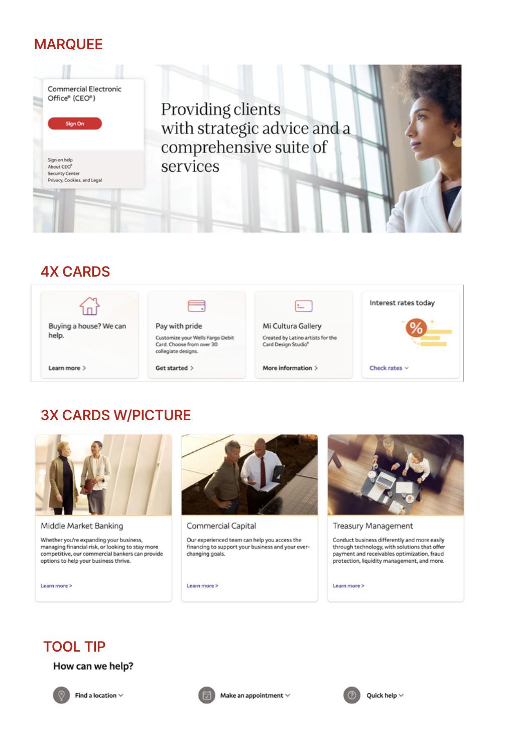
Component Analysis
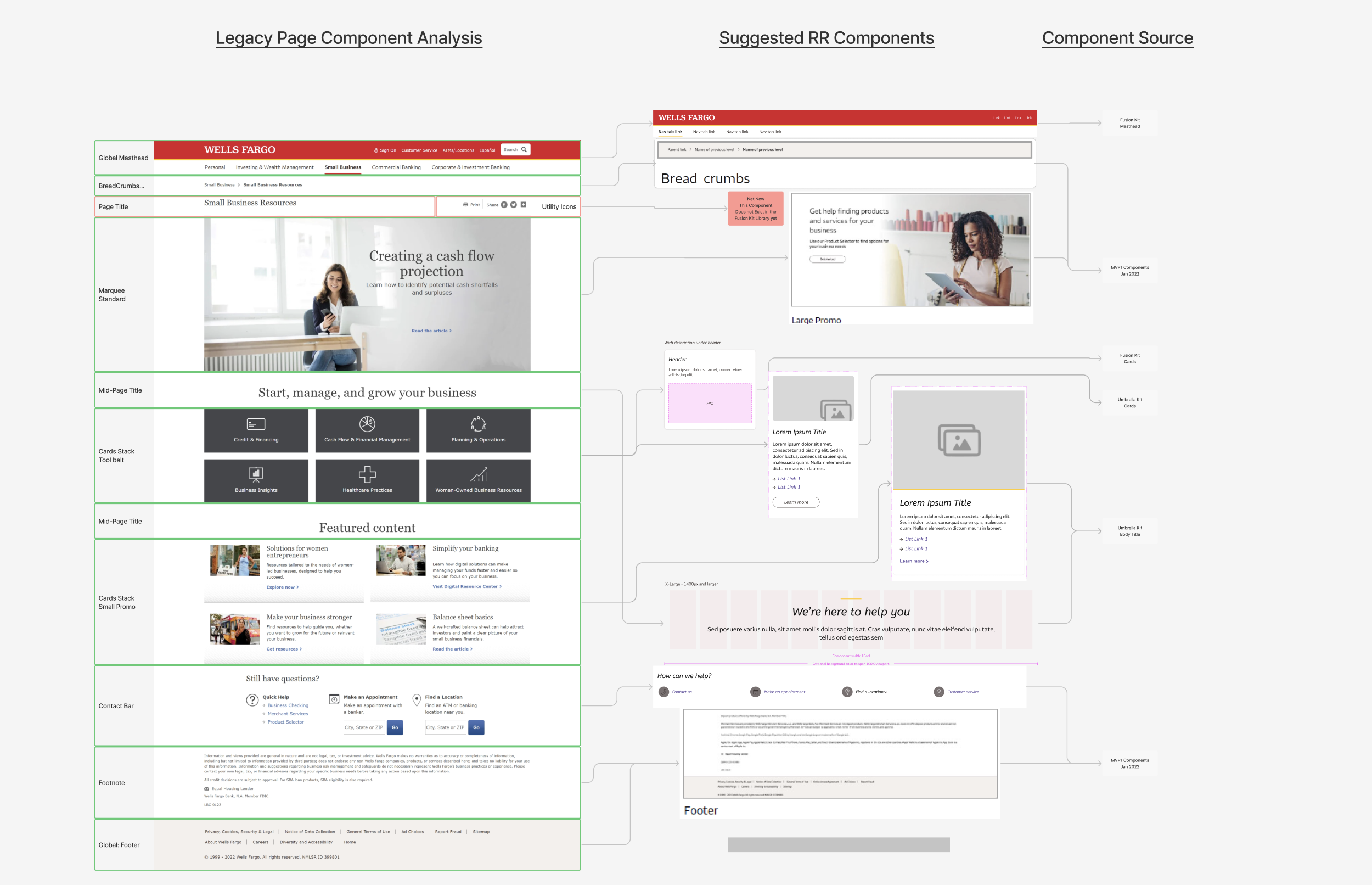
Component Variants
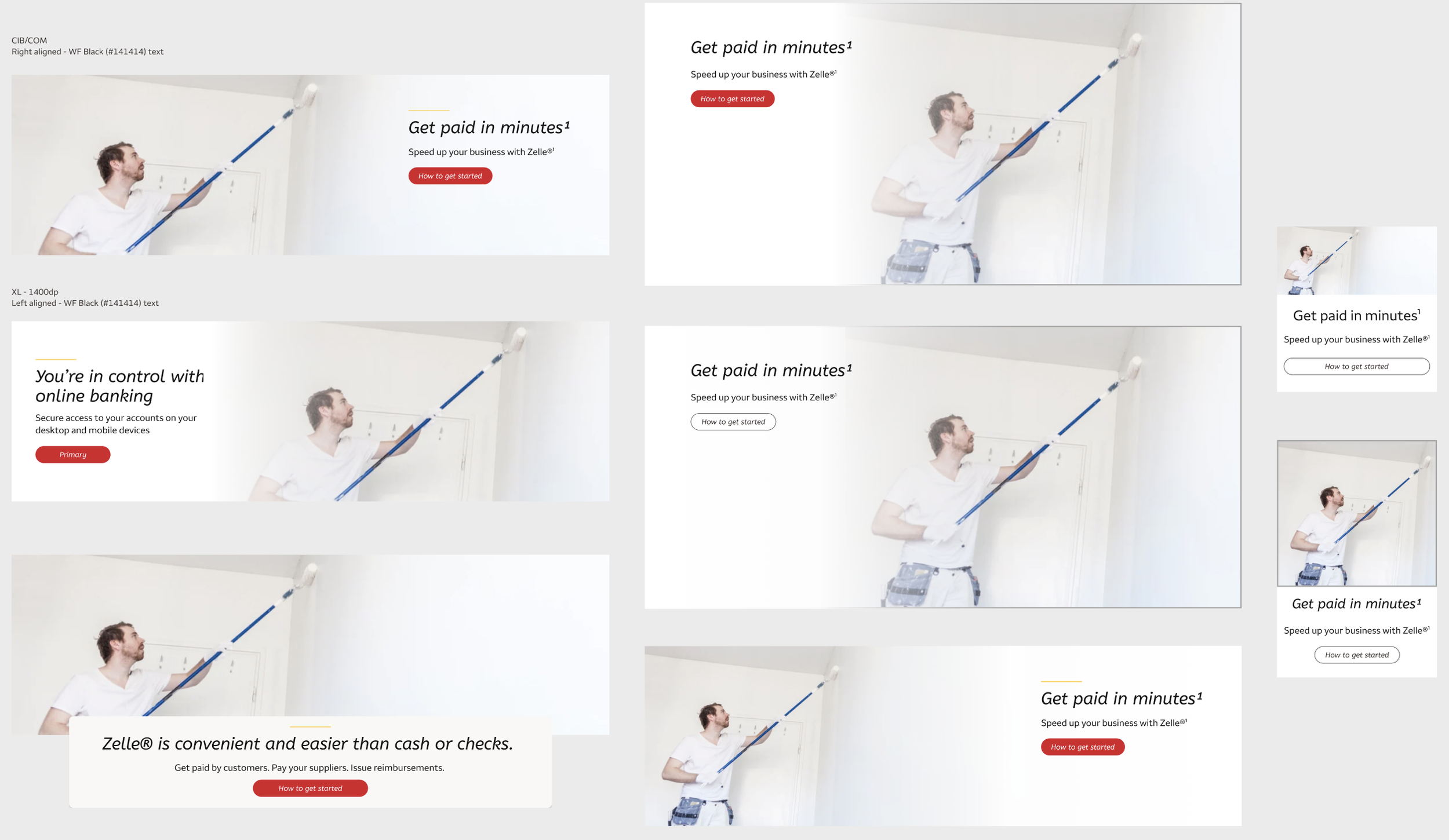
Component Library
A second analysis took place within my smaller team of UX Designers in regards to the current responsive components used and which we could reuse for our pages which had yet to be upgraded. Which responsive components did we need variants and which were net-new to be made for the Design Library. From set of components, I made templates to suit the needs of all of our pages. This step required much investigation and negotiation with our CMS Team.
UX Design Director - Darren W.
UX Architect - Mark Anthony R.
Figma Library Designer - Mark F.
Pod #1
Lead Product Designer - Mischa P.
Junior Product Designer - Serina W.
Content Strategist - Brett L.
Content Strategist - Kendal B.
Product Owner - SB Credit - John G.
Product Owner - Zelle - Lisa S.
Pod #2
Lead Product Designer - Alvin C.
Junior Product Designer - Shreya N.
Content Strategist - Shane J.
Content Strategist - Kendal B.
Product Owner - Banking Accts - George G.
Product Owner - Merchant Services - Lisa S.
SB RR Team
Content Strategy
In order to move forward, it was essential to work side-by-side on a daily basis to create 3 versions of what the copy might sound like if we reduced it and made it more concise.
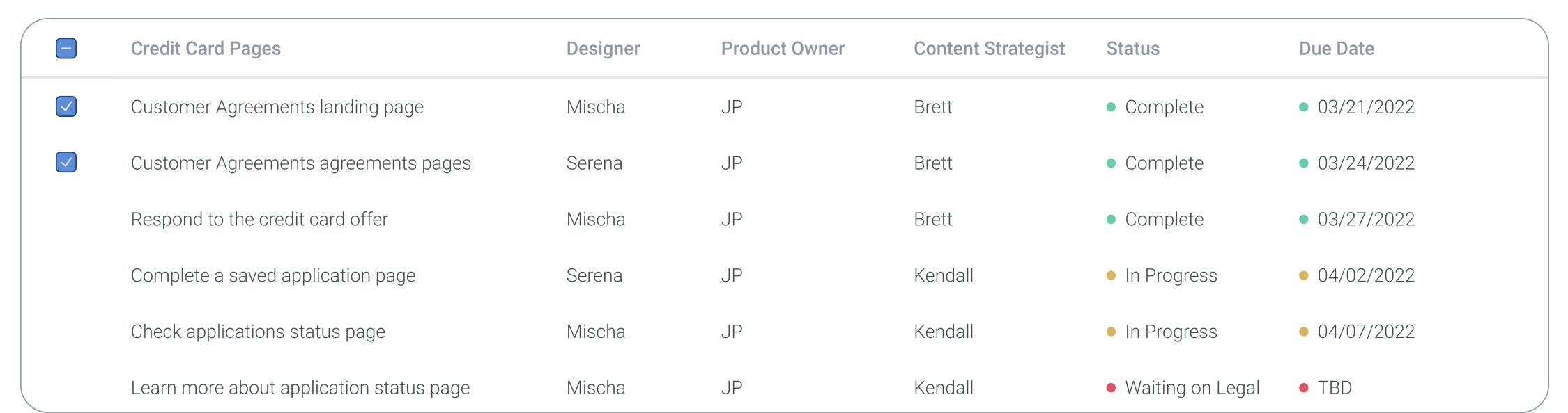
Project Plan
UX Design Sprints 2022
Responsive Re-Design
Qualitative Business Goals

Small Business Hub Page
Clean and easy way to sign up
Educate the Small Business Owner
Showcase the Rewards of Small Business Credit Cards Compare page
Showcase the Merchant Services Payments
Highlight the Product Selector to help new and existing users find out with products or services meet their needs
Instill trust in the consumer to do their Small Business Banking with Wells Fargo
Inform users about the App and link to download it.
Solution:
Small Business Hub Page
A fresh approach to
a trusted financial institution.

“This new homepage is fresh, informative, easy to use, and concise. Moreover it helps me get to exactly where I need to go. “
-Quote from an existing consumer taken from user testing

[Stock photo]
Quantitative Business Goals
SB Credit Card Hub Page
1. Click Apply Now for Platinum CC
2. Click Apply Now for Business Elite CC
3. Click Apply Now for Secure CC
Lines of Credit Hub
1. Click Apply Now for Business Lines of Credit
2. Click Apply Now for Prime Line of Credit
3. Click View Details for Business Lines of Credit
4. Click View Details for Prime Line of Credit
Checking Hub Page
1. Click Compare account
2. Click See details and apply for Initiate
3. Click See details and apply for Navigate
4. Click View details and apply for Optimize
Solution:
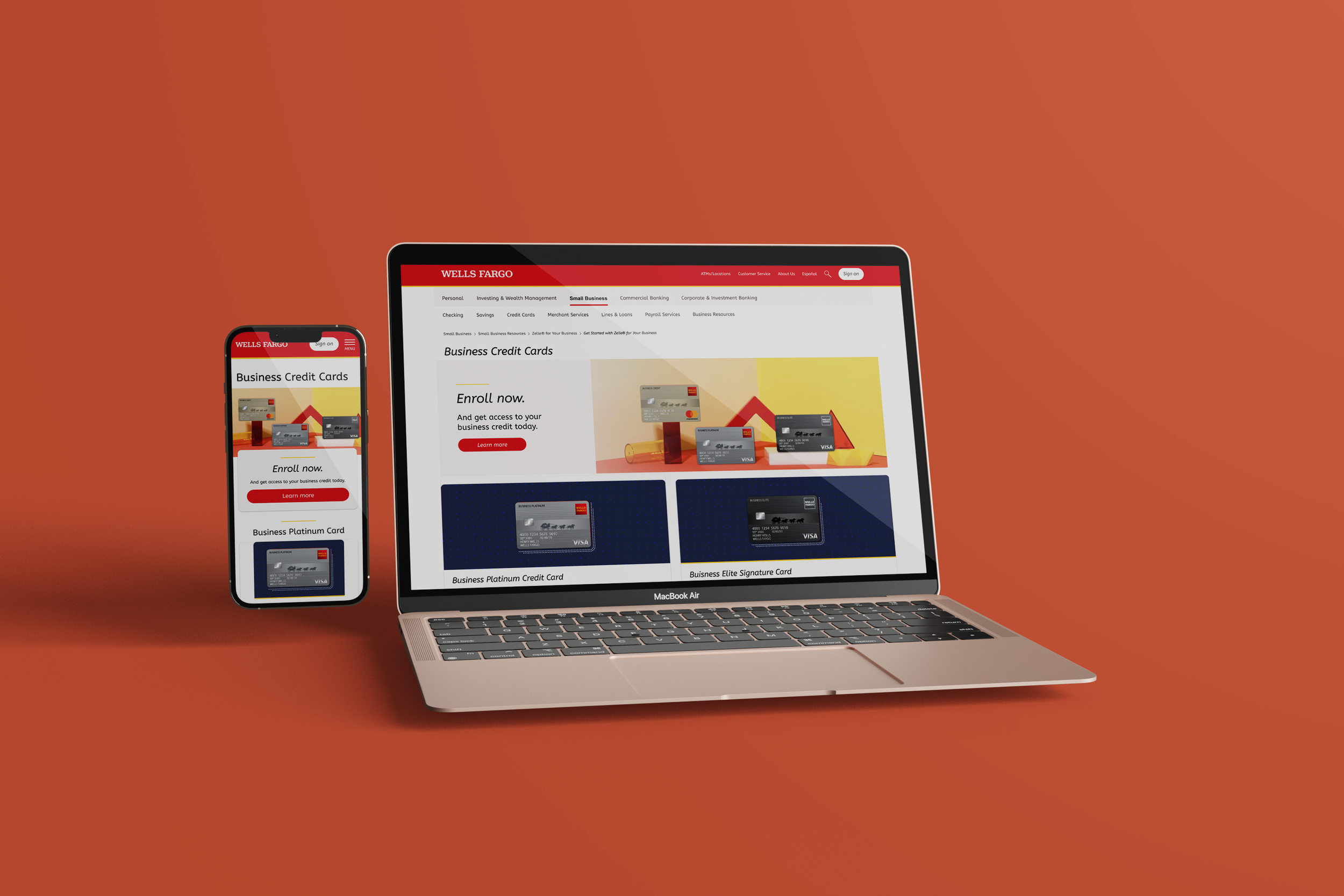
Small Business Credit Cards Hub
Easily compare options and find the best card for your business.
Solution:
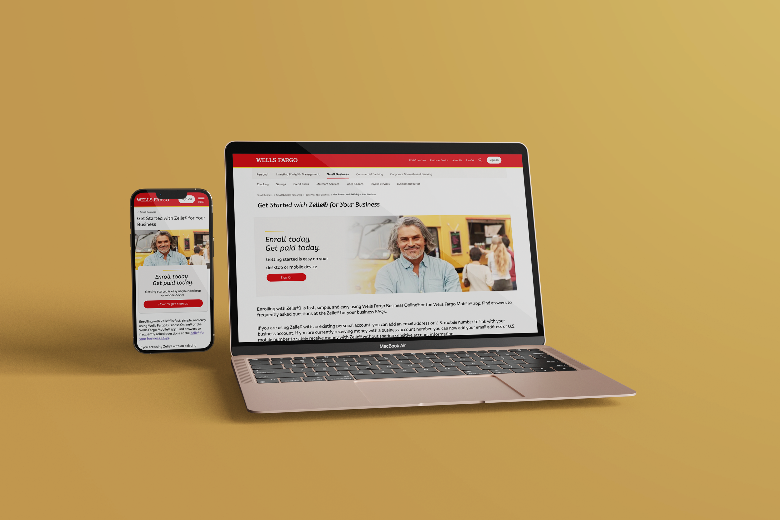
Zelle for Business
Getting paid is easier than ever.
Solution:
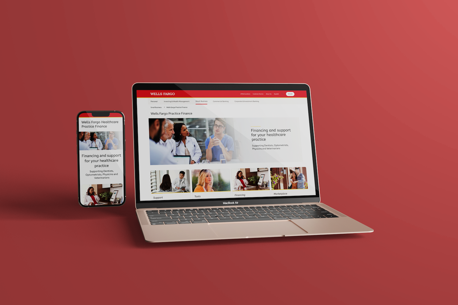
Healthcare Practice Financing
Easy Financing for Doctors & Dentists
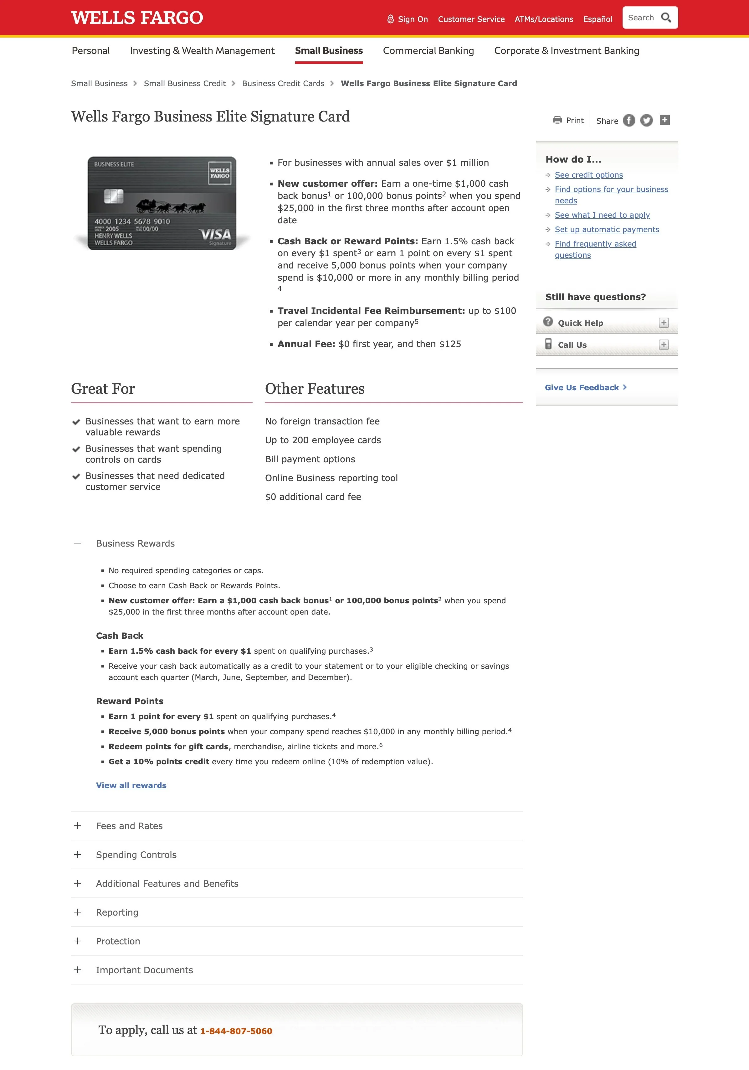
Credit Card Detail Page
-
Before
-
After

Mobile, Responsive, and
User Friendly.